case study
custom brandmark & Logo Reveal | BANNERS |YARD SIGNS |Social media package | business cards
We had the opportunity to partner with a Brand New North American Missions Church that launches May 2015. With this design we wanted to capture the spirit and direction of this new Church plant. This concept was created according to the request for a branding that portrays class and the usage of black and neon green colors.
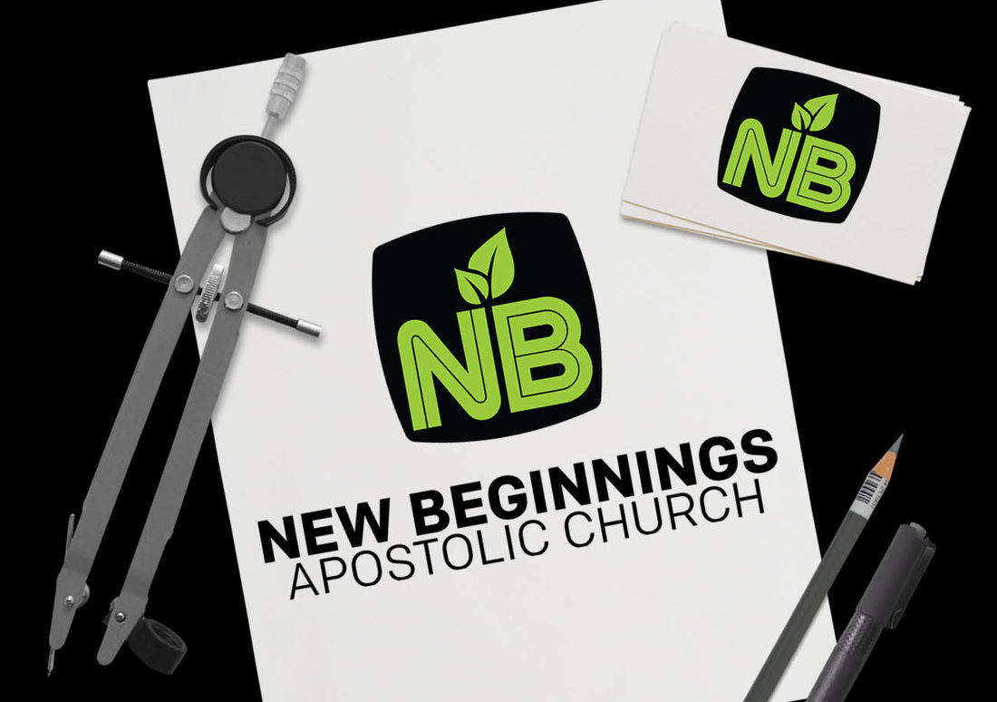
The concept that we felt represented New Beginnings the most was a simple, clean, and classy superellipse. We also felt that a icon that represents the tagline is a simple leaf icon that is growing out of the NB(New Beginnings). The thought behind this was two-fold, first, this is a new church and it also represents the new beginning that is available for the community of where the Church is being planted. The icon transmits the idea of new life and a fresh start.
The typeface(font) used for New Beginnings is Colfax. The Colfax Type is a refined oval sans serif of 20th century origins and 21st century sensibilities. It’s a beautifully crafted, strong sans serif that has a very peculiar aesthetic that will give all of New Beginnings materials a solid, confident visual language.
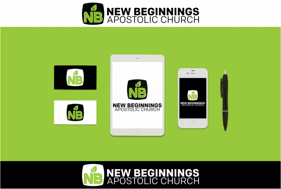
The use of 2 colors is featured. A neon green and black combination which are both functional and eye-catching. This is a very classy and energetic color combination and can be used across all of your marketing material such as a website, social media, signage, postcards, shirts, and so forth. The Brand mark not only works well on light backgrounds but also dark background. The logo can also be reproduced at any size and maintain readability. It can be a stand alone brand mark that is memorable, simple, & versatile.
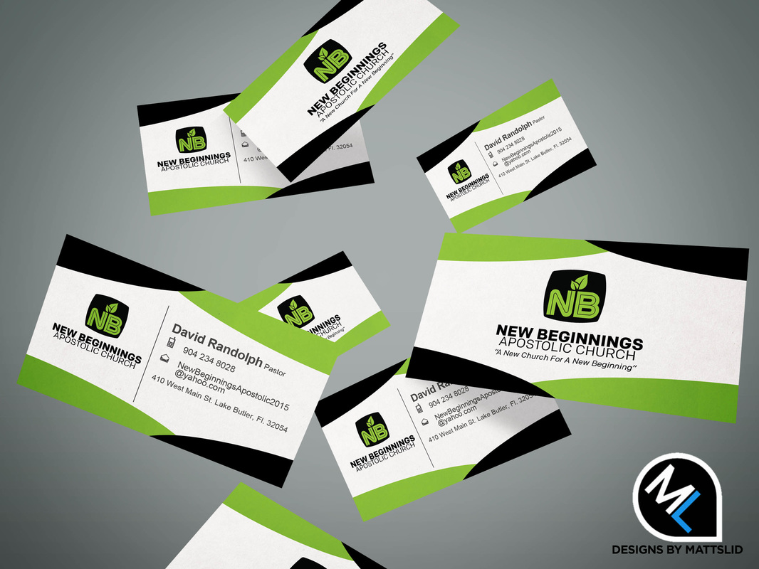
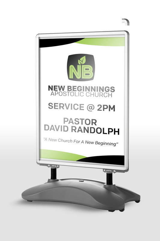
Below you can find several items that will show the functionality of the brand mark.
The concept that we felt represented New Beginnings the most was a simple, clean, and classy superellipse. We also felt that a icon that represents the tagline is a simple leaf icon that is growing out of the NB(New Beginnings). The thought behind this was two-fold, first, this is a new church and it also represents the new beginning that is available for the community of where the Church is being planted. The icon transmits the idea of new life and a fresh start.
The typeface(font) used for New Beginnings is Colfax. The Colfax Type is a refined oval sans serif of 20th century origins and 21st century sensibilities. It’s a beautifully crafted, strong sans serif that has a very peculiar aesthetic that will give all of New Beginnings materials a solid, confident visual language.
The use of 2 colors is featured. A neon green and black combination which are both functional and eye-catching. This is a very classy and energetic color combination and can be used across all of your marketing material such as a website, social media, signage, postcards, shirts, and so forth. The Brand mark not only works well on light backgrounds but also dark background. The logo can also be reproduced at any size and maintain readability. It can be a stand alone brand mark that is memorable, simple, & versatile.
Below you can find several items that will show the functionality of the brand mark.
CLIENT FEEDBACK
"I am a church planter starting a church in Lake Butler, Fl.. I was referred by another church planter. From the start of the branding process to all of my printing needs, I am very excited and happy with the way everything turned out. I am very satisfied with Matthew Smith's work. I highly recommend him to all pastors and friends! " - David Randolph|New Beginnings Pastor