case study
Your brand isn’t just a logo, and it isn’t just your mission statement either. It is the set of thoughts and emotions that come to mind when someone reads or thinks about POTC Student Ministry- their perception of who you are through what they see and hear about you. POTC has been around for 80+ years and haS a great rapport with their community.
Those undefined things such as atmosphere, reputation, trust, unity, safety, quality of services and value are all communicated through a brand, whether it is intended or not.
So with this design I wanted capture the branding of ASCEND. This concept was created according to the request for a branding that portrays a challenge to the students, inspires purpose, empowers, and to call to be a part of the journey.
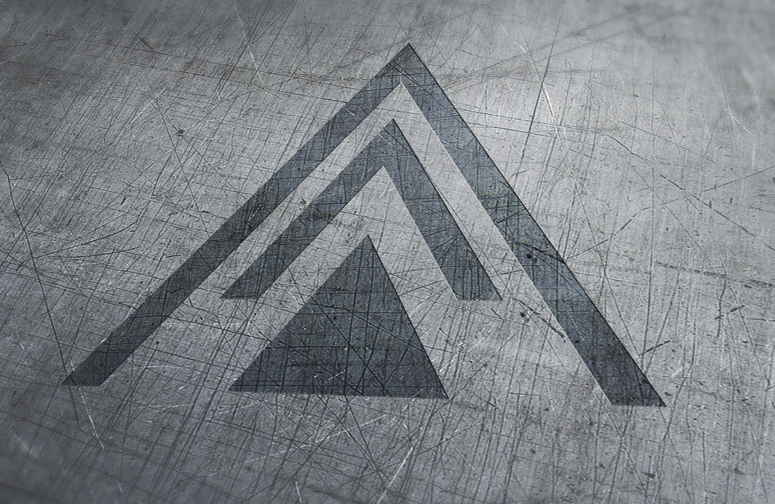
The concept that we felt represented ASCEND the most was a balanced, edgy, modern, clean, young, and striking brand mark. The inspiration of the design came from Psalms 24:3-4 "Who shall ascend the hill of the LORD? And who shall stand in his holy place? He who has clean hands and a pure heart…". The thought behind this was two-fold, first, to create a brand mark that is signifying upwards relaying the message to rise up & call to a higher place. Also, the arrow is positioned in a way that it is seamlessly works within the typography of the logo. The icon transmit the idea of purpose, power, and most importantly ascend.
The typeface(font) used for Ascend is Gotham. It is a modern sans serif that can be read on both a large and small scale. It’s a beautifully crafted, strong sans serif that will give all of Ascends materials a solid, confident visual language.
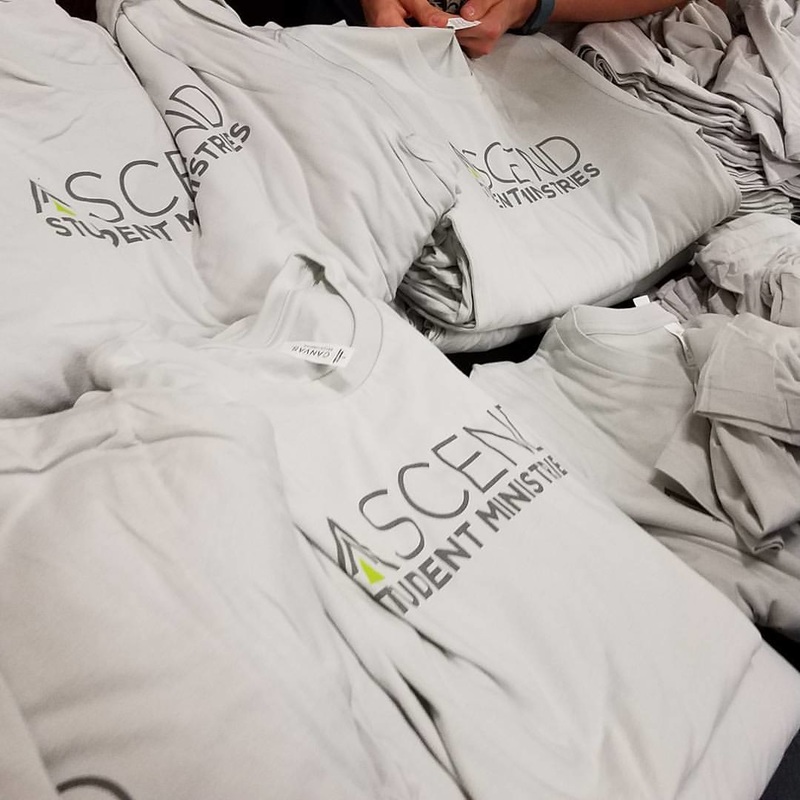
The use of 2 colors is featured. A green and grey combination which are both functional and eye-catching. This is a very bold and energetic color combination and can be used across all of your marketing material such as websites, social media, signage, postcards, shirts, and so forth. The Brand mark not only works well on light backgrounds but also dark background. The logo can also be reproduced at any size and maintain readability. It can be a stand alone brand mark that is memorable, simple, & versatile.. Below you can find the Logo Reveal we created for ASCEND & several other items that we have done to help grow their brand & identity.
Those undefined things such as atmosphere, reputation, trust, unity, safety, quality of services and value are all communicated through a brand, whether it is intended or not.
So with this design I wanted capture the branding of ASCEND. This concept was created according to the request for a branding that portrays a challenge to the students, inspires purpose, empowers, and to call to be a part of the journey.
The concept that we felt represented ASCEND the most was a balanced, edgy, modern, clean, young, and striking brand mark. The inspiration of the design came from Psalms 24:3-4 "Who shall ascend the hill of the LORD? And who shall stand in his holy place? He who has clean hands and a pure heart…". The thought behind this was two-fold, first, to create a brand mark that is signifying upwards relaying the message to rise up & call to a higher place. Also, the arrow is positioned in a way that it is seamlessly works within the typography of the logo. The icon transmit the idea of purpose, power, and most importantly ascend.
The typeface(font) used for Ascend is Gotham. It is a modern sans serif that can be read on both a large and small scale. It’s a beautifully crafted, strong sans serif that will give all of Ascends materials a solid, confident visual language.
The use of 2 colors is featured. A green and grey combination which are both functional and eye-catching. This is a very bold and energetic color combination and can be used across all of your marketing material such as websites, social media, signage, postcards, shirts, and so forth. The Brand mark not only works well on light backgrounds but also dark background. The logo can also be reproduced at any size and maintain readability. It can be a stand alone brand mark that is memorable, simple, & versatile.. Below you can find the Logo Reveal we created for ASCEND & several other items that we have done to help grow their brand & identity.
feedback
"When I hired Designs by Mattslid to rebrand our student ministry I was looking for a powerful brand that would embody our vision and mission for our student ministry for years to come. His process is thorough and he truly is concerned with capturing the essence of what we want our brand to convey to the community. Our students instantly loved the new brand!" - Johnathan Nazarian|Student Pastor